How Sparse Data Can Drive Information Density

There is a lot going on in the world of big data today–at times, enough to make your head spin. But instead of trying to pry an advantage from every big data source, you might get better results by concentrating your analytical energies on rather thin data streams that nevertheless carry lots of weight.
All things being equal, more data is better. You can drive down uncertainties by analyzing entire datasets instead of just sampling. You can create new insights by combining datasets in creative ways. With Hadoop and in-memory data grids and stream processing and machine learning algorithms and unlimited computational and storage (Hello, AWS), at times it seems almost within our grasps the possibility of becoming all-knowing Big Data Gods (Hello, NSA).
But of course, all things aren’t equal. For starters, not all data is created equal. At best, it can be dirty or incomplete, or at worst, totally misleading. Like it or not, our data analytical desires are still bound by limitations in the hardware, the software, and the people who build the applications (not to mention budgets). While processing, storage, and network costs have dropped significantly and algorithms and artificial intelligence at times seem poised to take over, they still provide present limitations in how we perceive the world.
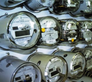
Now that your big data bubble is popped, you can start assembling, from scratch, a data analytic solution worth keeping. Of course, you’ll begin with your best and most valuable data source. For Badri Raghavan, CTO at energy analytic solutions provider FirstFuel, that means doing a relatively simple task: reading the meter.
“On the face of it, it’s extremely sparse data,” Raghavan says of the usage data FirstFuel pulls from energy meters, either for electricity or gas. “But it has enormous hidden information and insight if you have the right tools to exploit it.”
FirstFuel is one of the outfits vying to help customers save billions of dollars by making their large buildings more energy efficient. In FirstFuel’s case, it starts the process by loading time-series data from the meter, which typically take usage readings in five, 10, 15, or 30 minute intervals, although some smart meters have shorter intervals.
Raghavan’s team then blends this data with handpicked sources of unstructured data available from the Web, such as type of building construction, original construction date, and if there have been any energy-efficient renovations (Google Earth sees all solar arrays). Once loaded into its proprietary data model, FirstFuel is able to deduce all sorts of useful information for the customer, including how efficiently their individual lighting, HVAC (heating, ventilation, and air conditioning), elevator, and data center systems are functioning, and how they stack up against peers in their industry.
Nobody designs a big building to waste energy, but typically there are significant gains to be made. Customers use their FirstFuel energy scans to see where they can make upgrades that have the biggest impacts in energy efficiency. The result is that customers typically slash their energy usage by 10 to 35 percent. While the data stream is sparse, the economic impact is large when you realize that about 25 percent of the U.S. total energy generation is consumed by just 7 million large commercial buildings. There is a lot of low-hanging fruit for those who know how to grab it.
Raghavan, who was on the team that created the FICO credit rating system, scratches his head when he looks at the complexity of his competitors’ models, which involve gathering large amounts of data about every aspect of a building, such as the roof construction, the buildings thermal envelope, the glazing, and the nameplate capacity of gas heaters. None of that is necessary to reap big rewards in energy efficiency at this early stage in the game, he says.
“They need more and more data, because they’re building a model from the ground up,” he says. “They want to leverage all this data to extract insight and business value from it, but sheer volumes simply don’t help. You need to look at the right places and for the right sort of signals as well. My belief is it’s not the quantity of the data that matters, but the quality of the analysis. In other words not all data is the same, and more data is not the same as better data.”
Raghavan is a fan of statistician Nate Silver’s empirical approach to analytics, and above all not confusing signals for big data noise. He questions the usefulness of big data approaches that attempt to draw correlations from multiple datasets when it distracts from solving the problem at hand. In First Fuel’s case, a sparse data stream is an excellent starting point, because it provides a clear and clean metric that is directly correlated to the problem he’s trying to solve: reducing energy usage.
Instead of pulling meter data, FirstFuel could have attempted to solve its problems by ingesting details of customers’ energy bills. The big problem with the bill-based approach is it doesn’t have that extra dimension of time built into it. That is, it lacks information density.
“By contrast, by starting with this very thin stream [of meter data] I can effectively perform a very sophisticated energy audit with a very specific and highly actionable item developed from that,” Raghavan says. “Therefore in our concept the meter has a high-degree of information density in it, and the bill has a very low amount of information to it.”
If your data model has too many variables or is too complex, you run the risk of getting too far away from what’s relevant, and falling into a big data pit of confusion. At that point, it will be tough to tell the signal from the noise. “It’s like building a dining table from analyzing the atoms that compose them,” Raghavan says. “You can never get here from there, as people say.”
It may seem like common sense, but sometimes it takes a bit of trial and error to figure out what works best. These lessons apply to architecture (and furniture-making), as well as data science.
Take for example some of the new super-efficient building designs that have garnered industry acclaim through the LEED green-building certification. Some of these buildings were designed to use ambient light to eliminate the need to use electric light. “But it turned out all that natural light heated up the space in side, so the AC really started cranking,” Raghavan says. “Some of them in fact are wasting large amounts of energy.”
The FICO score that Raghavan helped create at Fair, Isaac and Company is another example of data with real gravity and density to it. FICO scores are based on the activities of a consumer—every credit card purchase, home mortgage application, and late payment has an effect on the score. “It’s a skinny data stream, and it tells you something very important and rich about that spending behavior,” he says. “To me it’s mathematically the equivalent to go from a consumer-generated time series of data to a building generating that time series of consumption data.”
FirstFuel is striving to create the equivalent of the FICO score for the energy efficiency of buildings. Just like FICO, FirstFuel has proprietary algorithms running behind the scenes, and it’s not the only game in town. And like FICO, FirstFuel reminds us that, by starting with relatively thin streams of sparse data, we can sometimes get surprisingly accurate models of complex systems in the real world.
Related Items:
Five Steps to Drive Big Data Agility
Forget the Algorithms and Start Cleaning Your Data


