Evolution of Data Wrangling User Interfaces
We’re back for session two of the data school! In this video, we travel back in time to the early days of data transformation and take a closer look at how user interfaces have evolved over the years. Even though the wider data management field has grown in leaps and bounds, it’s striking how little innovation there has been in user interfaces for data transformation since the 1980s.
In the beginning there was code. In the early 1970s we saw the first programming language designed specifically for data transformation: DATA STEP from the SAS Institute. Like most programming languages developed around that time, you had to type out the code using a keyboard connected to a mainframe. Similar functionality can be found in programming libraries for more recent languages, like Python’s “pandas” library, or R’s “dplyr” library.
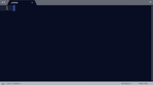
Experts love to write code, and programming libraries are certainly powerful. But let’s talk about the standard UI for code: the text editor.
Code is extremely powerful, and useful for a wide array of end to end data applications, but for many analysts, it’s simply too technical, and for those who are proficient, code does not provide much visual guidance to help understand and transform data.
Fast forward just a few years to 1979, shortly after the introduction of the Apple ][ personal computer, and Visicalc arrives–the first spreadsheet. Suddenly you could see your data, laid out in rows and columns, and manipulate the data directly using the keyboard. Today, the spreadsheet remains the baseline for end-users to get eyes on small amounts of data and transform it. But what about when you have way more than a few screenfulls of data?
Well if you’re watching this video, you may be familiar with “ETL” tools, Exract-Transform-Load, for data transformation. ETL suddenly allowed organizations to transform large volumes of enterprise data. How did ETL originate?
Well, maybe it’s no surprise that they go back to the introduction of the Macintosh in 1984. Windows, Icons, Menus and the Mouse changed our expectation of user interfaces and ease of use.
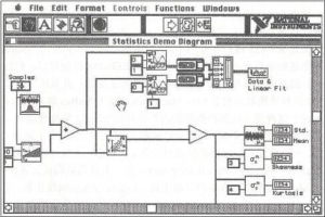 And from this came the idea of Graphical Dataflow Programming. This paradigm was pioneered in a product called Labview, which was released on the Macintosh in 1986. Rather than coding with textual commands, you drag, drop and graphically connect command icons, and fill in the dialog boxes for each icon. In some sense nothing got easier: this required just as much detail as DATA STEP and its friends. But the resulting interface was much easier to eyeball as a process of data flowing from one command to another. The Macintosh computer was a landmark innovation, but nearly everything has changed in computing since Labview was invented in the mid 1980’s. The web. The iPhone and iPad. Social media. The cloud. The data transformation industry has been way, way behind the times.
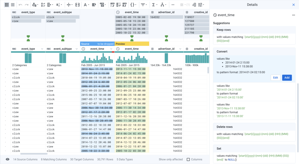
Spreadsheets transformed the way users could interact with data in a visual manner, and graphical data flow programming transformed the way organizations could transform data at scale, but what about when organizations want to transform their data at scale, with an interface that domain experts can understand? This is where Trifacta comes in. Combining visual guidance with machine learning driven suggestions, Trifacta allows users to visually explore their data, and interact with their data to clean, blend, and transform it. All of this work is synthesized into a recipe, automatically producing a scalable and repeatable dataflow process that can be run in serverless cloud infrastructure.
Interested in trying Trifacta for yourself? Start using Trifacta for free today!
