Johns Hopkins Launches COVID-19 Mortality Calculator, Aims to Inform Vaccine Prioritization

(Rost9/Shutterstock)
The first COVID-19 vaccine doses are going out in the United States, predominantly to frontline healthcare workers. Unfortunately, the vaccines are currently extremely limited, meaning that state governments are having to make difficult decisions about the order of vaccination priority. In most states, the plan involves frontline healthcare workers, followed by some combination of the elderly and people with preexisting immunocompromising conditions such as heart disease or diabetes.
Now, researchers at the Johns Hopkins Bloomberg School of Public Health have developed a data-driven COVID-19 mortality risk calculator that allows any individual to estimate their own risk of death if infected with COVID-19 – and which the researchers hope will be used to inform the distribution of vaccines and other crucial resources.
In July, a team of UK researchers used OpenSAFELY – a secure health analytics platform covering 40% of patients in England – to analyze 10,926 COVID-19-related deaths in the UK and develop risk scores for various demographics and medical conditions. The Johns Hopkins researchers tweaked those risk scores based on U.S. mortality rate data provided by the Centers for Disease Control and Prevention (CDC). Finally, they combined the modified risk scores with projections of pandemic spread and mortality from epidemiological models in order to provide not just a risk of death if infected, but an absolute risk of infection and death over a given period of time.
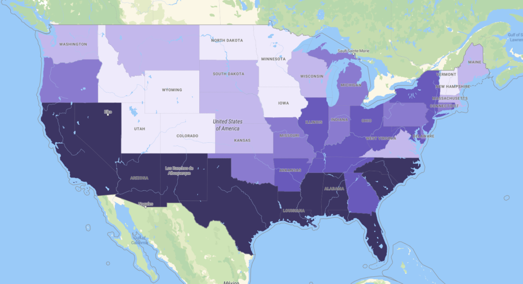
Having validated the model across 54,444 deaths in the U.S. from June to October, the researchers have now launched the tool for the general public, providing both an individual mortality risk estimator and an interface that shows the prevalence of higher-risk individuals across states and major metropolitan areas. For the latter tool, the researchers worked with PolicyMap, which describes itself as a “state-of-the-art mapping and analytics platform” intended to make geographic data “easily accessible and understandable to policy-makers.”

The PolicyMap risk view at the state level. Dark shades indicate a higher average relative population risk of COVID-19 mortality.
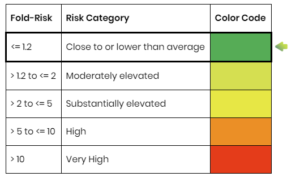
When users enter their information – age, height, weight, chronic conditions, ethnicity, sex assigned at birth, zip code – they are presented with their risk relative to the average U.S. population (as a multiplier) and an absolute risk of death (per number of people in “subgroups of the population with a similar risk profile to yours”) from December 12th through January 1st.
Disclaimers pervade the tool: “the information provided by this tool is not for medical advice and cannot be used to diagnose or treat any medical condition”; “an individual’s risk will also heavily depend on personal behavior such as social distancing, hand-washing and mask-wearing”; “individuals who themselves have a low risk of COVID-19 serious illness and/or mortality … are still able to spread the infection to others who are at high risk.”
With that said, the researchers think the tool offers important conclusions: for instance, that roughly 4% of the population will constitute roughly 50% of the deaths and that at-risk populations vary wildly from area to area. “For example, the percentage of the adult population exceeding the fivefold risk threshold varies from 0.4 percent in Layton, Utah, to 10.7 percent in Detroit, Michigan,” said Nilanjan Chatterjee, a professor of biostatistics and epidemiology at the Bloomberg School and senior author of the study.
Chatterjee and his colleagues hope that this information will be useful for governments working to prioritize vaccine and mask distribution, as well as for individuals trying to understand their own level of risk in the pandemic.
“Although we have long known about factors associated with greater mortality, there has been limited effort to incorporate these factors into prevention strategies and forecasting models,” Chatterjee said. “People may understand broadly that with a preexisting condition such as obesity or diabetes, for example, they are at higher risk, but with our calculator they should be able to understand their risk in a way that takes multiple factors into account.”
Still, Chatterjee suggests that the tool not be used as a one-stop-shop for risk assessment.
“Our calculator represents a more quantitative approach and should complement other proposed qualitative guidelines, such as those by the National Academy of Sciences and Medicine, for determining individual and community risks and allocating vaccines,” he cautioned.
To access the individual risk calculator, click here.
To access the risk map, click here.


