
COVID Data Report Card: Mixed Results for Public Health

(rudall30/Shutterstock)
Throughout the coronavirus pandemic, the importance of “following the data” has been emphasized repeatedly, and for good reason: It provides the best chances for us to minimize the harm caused by COVID-19. However, when it comes to government officials actually adhering to the data-driven mantra, it’s a mixed bag, at best.
The entire world has relied on predictive models to forecast the spread of COVID-19 in an attempt to get in front of the virus and avoid the worst impacts. Since the virus emerged in the United States last winter, those predictive models have been quite good, says Babak Hodjat, the vice president of evolutionary AI at Cognizant, which has been involved in modeling the virus.
“It’s been surprisingly accurate in many of these regions to forecast,” says Hodjat, who has been tracking the virus and is currently a judge in the XPRIZE Pandemic Response Challenge, which seeks better predictive and prescriptive models for combatting COVID-19. “I can tell you, having stood up this system since May of last year, you could tell back in May that schools are not going to open in California, or that workplaces are going to remain shut.”
With COVID-19 vaccines now available, public health officials have the best weapon yet to stem the spread of the coronavirus, which has infected nearly 108 million people around the globe and killed almost 2.4 million, according to the Johns Hopkins University Coronavirus Resource Center. In the U.S., the data shows we’re on the downslope of the third surge, an event that was predicted by models developed by Cognizant and others.
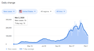
Three surges are clearly evident in the 7-day trailing daily tally of COVID-19 cases in the United States (image source: Google)
As new variants emerge and spread rapidly, it’s now a race against time to vaccinate as many people as possible before the virus regains strength and mounts a fourth surge against its human hosts. But a fourth surge is a likelihood in practically every model at the Fred Hutchinson Cancer Research Center, according to a new paper published last week. The variants make a fourth surge, probably starting in late March, a likelihood.
The only scenario in which it doesn’t make a fourth surge likely, per the cancer center’s study, is if the vaccines remain resistant to the variants, if the vaccination rate is dialed up past the current goal of 1.5 million shots per day, and if people become even more strict about mask-wearing and social distancing.
These are scenarios that the teams participating in the XPRIZE have been modeling, with the goal of coming up with the model that best informs public health officials about how to proceed in combatting the virus. Cognizant’s Hodjat is hopeful the XPRIZE will yield the best of data-driven science.
“As new strains come in, as new interventions come in, you’re retraining your whole model, your prediction and prescription, almost on a daily basis,” he says. “That’s the best we can do. There’s no crystal ball. We won’t know for sure. But the best we can do is keep up with the data as it changes.”
His best estimate at this point is that we probably won’t nip it in the bud this spring. “I think we’ll be with this pandemic for a while,” Hodjat says. “I’m hoping upon hope that we can get in front of it with the vaccine. But I don’t know if that’s going to happen.”
Public Health Response
With dual mandates–to stem the spread of COVID-19 while minimizing damage to the economy–public health officials are in a tough spot. In some ways, it’s a no-win situation, as there’s no way to prevent damage to either side. But by adhering to the data and gaining as much precision as possible in prescribing methods with the best chances of stemming the spread, we can achieve the optimal balance between our medical and economic well-beings.
“We’re not solving for a single objective,” Hodjat says. “There are two objectives. The economy matters. Containing it matters. There’s a balance you need to achieve between containment and the economy. I think it’s very important for regional authorities to take that into account, that there is no one answer.”
As infectious disease experts and data scientists try to keep up with the changing conditions on the ground, public health officials are fighting to maintain the data-driven high ground. One of the states that has struggled greatly in stemming the spread of the disease while mitigating economic impacts is California.
Governor Gavin Newsom won praise in March 2020 for instituting one of the nation’s earliest lockdowns. Over the ensuring months, California maintained one of the strictest lockdown profiles in the country. The state’s Department of Public Health devised a color-coded system that corresponded with which activities would be allowed in each of its 58 counties. As the situation improved in the summer, lockdowns were eased in certain counties, only for the number of infections to rise again in the fall.
However, as the number of infections in the Golden State rose in early December, the Department of Public Health abandoned its previous color-coded system and replaced it with a new regional lockdown scheme that was dependent upon a single metric. Instead of basing the decision to shut down businesses and schools on factors like the case rate per 100,000 people, the number of community outbreaks, or a trailing 14-day average for positive COVID-19 tests, as it was before, the lockdowns in California hinged upon a single metric: ICU capacity.
What’s more, instead of using the actual ICU capacity figures that hospitals share on a near daily basis, California DPH created a derived figure that attempted to build a buffer into ICU capacity for non-COVID cases. The state did this by marking ICU availability down by 0.5% for every 1% of ICU capacity used by COVID-19 patients above the 30% threshold. This change resulted in the Southern California region, which is home to over 20 million people, having an ICU availability rate pegged at 0% for over a month despite the fact that thousands of ICU beds were actually available across the region.
Crouching COVID, Hidden Data
Confusion around California’s approach grew until late January, when members of Newsom’s administration said there was another factor at play in the lockdown order: forecasted ICU availability. The situation reached a head for Newsom’s administration when public health officials refused to share the model that it used for the forecast.
California Gov. Gavin Newsom’s administration has come under fire for repeatedly changing criteria for lifting the COVID-19 economic lockdown (mccv/Shutterstock)
“At the moment the projections are not being shared publicly,” Department of Public Health spokeswoman Ali Bay told AP reporters via email in January. “These fluid, on-the-ground conditions cannot be boiled down to a single data point–and to do so would mislead and create greater uncertainty for Californians,” California Health and Human Services spokeswoman Kate Folmar told AP reporters.
Soon thereafter, Newsom announced that California was abandoning the five-region approach based on the adjusted ICU metric and going back to the original color-coded, county-by-county scheme. The stated reason for this change was that the projected ICU availability metric indicated that new infection rates would begin to abate. But without access to the data or the models, nobody but Newsom’s administration knew for sure.
This lack of transparency into data, as well as the continual shifting of metrics that are the basis for lockdowns in the nation’s most populous state, have eaten into Newsom’s popularity. This has helped to spur an attempt to recall Newsom, whose popularity rate has fallen nearly 20% over the course of the pandemic. (The fact that the governor was photographed attending a mask-less dinner party with a dozen others, while asking citizens of the state to avoid such gatherings, added fuel to the recall fire).
Political Data Lessons
The story of Newsom’s handling of the coronavirus epidemic in California is not yet over, as a projected fourth wave threatens to bring numbers back up. The continued lockdown of schools and the failure of distance learning for over a million California students who have not yet returned to in-school instruction adds a political intangible to Newsom’s COVID decision-making.

Australia’s strict lockdown is credited with keeping COVID-19 deaths under 1,000 for a country with 24.3 million
California’s story stands in contrast to how the pandemic has been handled in Australia, which has seen fewer than 1,000 deaths and has gone long stretches without COVID-19 cases (although a case of COVID-19 in Melbourne, the home of the Australian Open tennis tournament, has instituted a 2-million person lockdown in recent days).
Glen Rabie, the CEO of Australian analytics firm Yellowfin, gives credit to public health officials in Australian states for enacting a very tough lockdown in the beginning of the pandemic and largely sticking with it.
“The Australian approach was far tougher very early on,” Rabie tells Datanami. “Mistakes in the process were made [in Victoria] which led to the very long lockdown. However, there was a political will to enforce these policies with a view that it is better for the entire population versus the rights of individuals.”
There were significant costs to this approach, but politicians in Australian states (which, like their American counterparts, were in charge of the response to the virus) were willing to pay that price, Rabie says. The one criticism that has stuck was that officials, primarily in the state of Victoria, home to the city of Melbourne, have repeatedly moved the goalposts, which has weakened the trust that the governed put into their leaders.
“A criticism of the general political approach to lock down would be the lack of guidance driven by the data,” Rabie says. “It seemed that decisions were largely made on the fly and that communicated thresholds–i.e. if we hit this level of daily rates we will open retail–were often changed. This gave the perception that data and facts were not in actual fact being used by the Victorian government in particular to make decisions. Rather a very large hammer was being used to crack in some cases a very small nut.”
An American Lesson
In recent days, reports have emerged that New York Governor Andrew Cuomo office withheld data about the number of COVID-19 deaths in nursing homes out of fear that it would cause political damage. More than 15,000 people died of COVID-19 in New York nursing homes following a controversial decision by the governor to move seniors infected with the virus out of hospitals and into nursing homes around the state.
According to a transcript of a call with state representatives, the governor’s secretary, Melissa DeRosa, stated that the governor’s office withheld the number of deaths because “we weren’t sure if what we were going to give to the Department of Justice…was going to be used against us.”
The COVID-19 pandemic has tested people and governments like they have never been tested before. In many cases, public health officials have maintained their allegiance to transparent data and open science, and it has resulted in successfully fighting the spread of the disease. But as we have seen in New York and California, there have been significant exceptions. The lack of transparency around data and the damage that does to the public trust may be one of the most enduring lessons of the COVID-19 pandemic.
According to Rabie, there were attempts to politicize the pandemic at the federal level in Australia early on, but it faded away. That has not happened in the U.S., where the politicization of COVID-19 modeling and data was amplified.
“The key failing in the U.S. was political,” Rabie says. “By politicizing the pandemic, data and facts were largely ignored and a consistent and coordinated health services response became all but impossible. Clearly there were (and are) parties in the U.S. that understand the data and the implication of the pandemic. However I suspect that no one anticipated the true cost of the pandemic to the general population and the economy as a whole.”
Related Items:
XPRIZE Seeks AI That Balances COVID-19 Containment, Economic Impact
How Data Can Help Optimize COVID-19 Vaccine Distribution
Algorithm Gets the Blame for COVID-19 Vaccine Snafu


