Plotly Bolsters Popular Python Data Viz Tool with GenAI
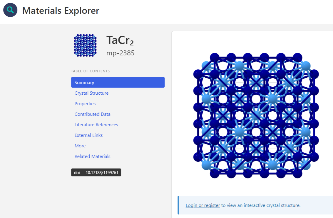
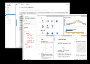
Materials Explorer is a data app developed with Plotly by the Berkeley Materials Project
Plotly Dash is a Python-based data application framework and visualization tool that’s widely used by data scientists who prefer a code-first experience. To help lower the barrier to entry, the company behind Plotly Dash today released a major update that lets users generate visualizations and explore data through a natural language interface powered by generative AI.
If you’re in the market for a Python-based data visualization tool, you’re likely to run into Plotly Dash, the data visualization tool released by the Montreal, Quebec technical computing company Plotly about a decade ago. The software is a favorite among data scientists who want to build data visualizations using the rich array of Python-based machine learning algorithms available (Pandas, Numpy, Scikit-learn, etc.) and also who want to create bespoke data science Web apps that enable deep data exploration.
It’s hard to overstate the vast popularity of Plotly Dash. The various open-source libraries that make up Plotly–including the popular Python library but also libraries for R, Julia, and JavaScript–is currently downloaded at the rate of 32 million times per month, and reached the one billion mark last year. The Plotly project on GitHub has more than 20,000 active community members and more than 115,000 GitHub stars, putting it in rarified air. Plotly Dash has been voted the number one open source tool in Databricks annual State of Data in AI survey for the past few years, and has been adopted by the Kansas City Chiefs, Bank of America, and Aetna.
It’s the flexibility of Plotly Dash that really strikes a chord among the community of data scientists who use it, explains Domenic Ravita, the vice president of marketing for Plotly.
“We find that [customers] often start with a BI tool or Excel…to try to build the custom data app that they’re trying to use for their business,” he says. “There’s no app on the shelf that does what they need, so they try to build it in-house. And they have a lot of dead ends with those kind of tools because they [don’t have] enough control. They don’t have the ability to integrate with Python well enough to run machine learning models and they can’t tailor the user experience with the pixel perfect UI they need.”
While BI and analytic tools may offer some machine learning capabilities, the ML capabilities are typically restricted to what the BI or analytic tool vendor has built into the product. They’re not able to access the vast array of ML algorithms available via open source. That creates an advantage for Plotly, which was designed from the beginning to be open and extensible.
“Anything you can do in Python, you can easily create a Plotly Dash application that pulls in that Python module and calls a machine learning model,” Ravita tells BigDATAwire. “You can reuse code. And so that open source data science approach is very different in terms of how the product is constructed versus a monolithic, mostly closed system of things like Tableau and Power BI.”
The code-first approach offered by Plotly Dash appeals to data scientists who are comfortable working from the command line. However, it has limited Plotly’s appeal to data analysts, who may know SQL but aren’t Python experts and who are most comfortable analyzing data from the comfort of a BI dashboard and its graphical interface.
That is one of the dynamics that drove Plotly to add the new GenAI capabilities with the new release of Dash Enterprise. Unveiled today, the updated product enables customers to use natural language to drive Plotly and to create visualizations. By using a large language model (LLM) to generate Python code for Plotly, it enables less technical users to use Plotly, Ravita says.
“We’re trying to lower the bar for the expertise that you need in Plotly code to refine the graph that you’re doing, to refine the analysis or the data transformation, or to refine how callbacks work with Plotly Dash,” he says.
The new GenAI capability is enabled through the App Studio, which is a GUI-based component of Plotly Dash Enterprise that enables visual creation in the tool. As the LLM converts requests from the user into Python code, that code also appears right on the screen and is fully functional and updateable, Ravita says. The combination of a GUI and code-based interfaces provide a powerful way for users to learn how to use the product, he says.
“You’re never obstructed from the code that gets generated underneath,” Ravita says. “So you can flip over and look at the Plotly code that gets generated by these added controls.”
Plotly Dash Enterprise’s new LLM capability is powered by OpenAI GPT models running in customer’s OpenAI accounts. Plotly handles the prompt engineering under the covers to ensure a smooth experience.
The new LLM will allow customers to drive Plotly using English language statements. For instance, you could ask Plotly to describe all your data, and the LLM will respond with an English-language description. You could drill down even more and ask Plotly Dash to apply a clustering algorithm and separate the clusters into different colors.
The interaction between the GUI and Plotly’s GenAI interface enables less-technical users to learn by doing, Ravita says.
“The good thing is you’re not just getting something that’s created out of a black box,” he says. “You can manipulate the UI widgets that are created or you can dive into the code and change those parameters. And it’s synchronized and gets updated in that environment, so it’s going to be a much faster learning loop.”
The new release of Plotly Dash Enterprise is bringing several other new features, including support for AnyWidget, an open source project that aims to bring uniformity to widget types in data science notebooks, including those from Juypter, Databricks, and Snowflake. Plotly is supporting AnyWidget in its open source software, too.
The company also is adding support for Narwhals, an open source project that enables data scientists to access an array of different data frame formats, such as pandas, Polars, Modin, and DuckDB from a single API. “So this provides a universal API such that it solves that dependency problem that you have in Python environments by abstracting that away,” Ravita says. “This is solving a big aggravation point for Python folks.”
While Plotly Dash provides the core Python-based visualization and data exploration capability, Dash Enterprise adds additional capabilities that companies may find useful, such as support for application lifecycle management, role-based access control, and a reporting engine that distributes “pixel perfect” PDFs, Ravita says. It also includes the graphical App Studio environment where the new GenAI capability lives.
Plotly Co-founder and Chief Product Officer Chris Parmer will be hosting a live webinar today at 9 a.m. PT to discuss the new GenAI capabilities. You can access the event here.
Related Items:
Is Zero Closer to Eight or to One?
Inside Pandata, the New Open-Source Analytics Stack Backed by Anaconda
Top Big Data Startups Honored at Strata
